Based in Amsterdam and working globally Smörgåsbord Studio is led by designers Alex Frew and Dylan Griffith.
The duo consistently create 'a selection of good things' for individuals and brands with whom they feel an alignment. Once a connection is forged, long-term collaborators and, subsequently, friends are made. Their creative output blurs the boundaries between brand identity, interiors, fonts, furniture, art and architecture.
Smörgåsbord relish being able to work ‘across the board’ — driving concept led brand experiences that bridge the digital and the physical. Their raison d'être is to craft memorable work that makes a difference to the everyday, whilst enjoying every fucking minute of it.
Brand Identity
Broadcast Design
Campaign Creation
Content
Creative Direction
Editorial
Film
Graphic Design
Illustration
Installation
Interior Design
Motion Design
Naming
Packaging
Photography
Product Development
Strategy
Tone-of-Voice
Typeface Creation
Website Design
For all enquiries or to request a full portfolio
E-mail ams@smorgasbord.studio
For an overview of past and present projects
Follow @smorgasbord_studio
Purpose personified
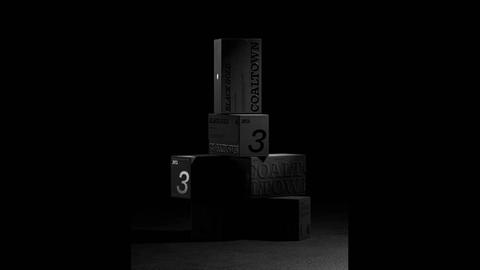
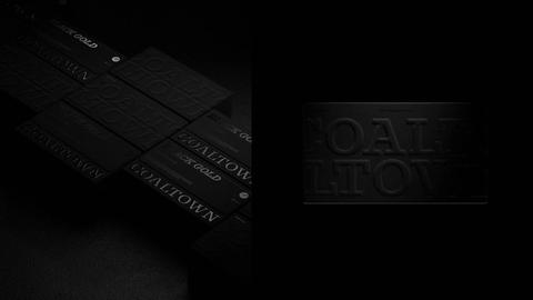
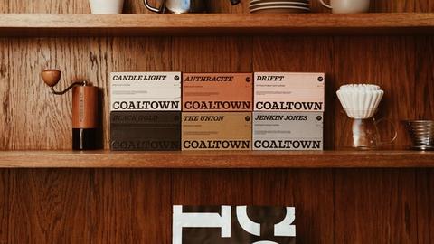
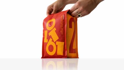
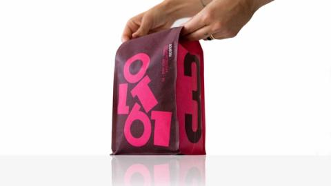
An exercise in evolution, not revolution. Coaltown’s foundations were already strong; our role was to refine and elevate. We began by rearticulating the brand strategy, clarifying Coaltown’s purpose and its reason for being. From there, we shaped a new visual language.
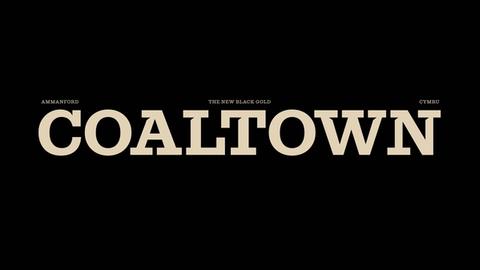
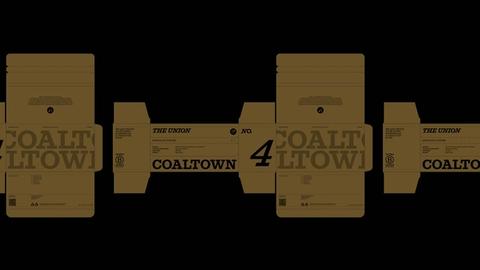
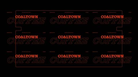
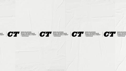
We chose to ‘celebrate the slab’. Coaltown’s logotype had long relied on a serviceable but unremarkable slab-serif typeface, so we sought a more crafted, characterful successor. That search led us to ‘Successor’, by New York–based Commercial Type.
Drawn by Tim Ripper and released in 2023, ‘Successor’ is a contemporary interpretation of the nineteenth-century English slab-serif – often referred to as Egyptian or Antique. Slab-Serifs dominated poster design from the Industrial Revolution through to the early twentieth century, when the Welsh coal industry was at its height. With 16 weights and cuts, it allowed the entire brand to be built from a single type family.
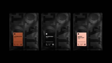
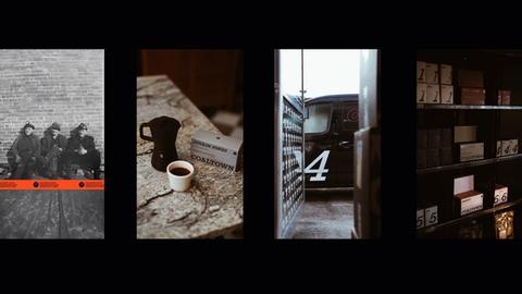
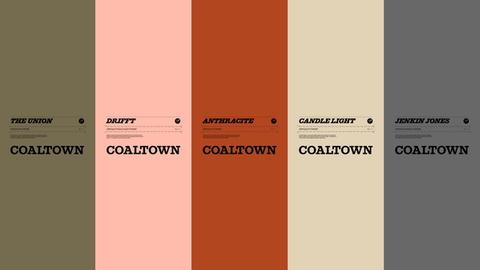
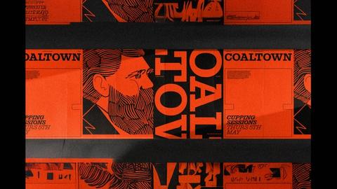
‘Coal Black’ remains Coaltown’s signature colour, complemented by five rich, muted tones inspired by the ‘House Coffee’ range. We’ve also introduced ‘Purpose Orange’ as an accent, drawn from the National Coal Board’s iconic donkey jackets – worn by miners from the 1960s to the 1980s and long a symbol of working-class identity.
Disciplines—
Brand Identity/Content/Creative Direction/Film/Packaging/Strategy
Credits—
Typography by @commercialtype
VFX by @dima_rdnv